SCRUD DADDY REDESIGN
Packaging true brand character
Client: Scrub Daddy
Agency: Product Ventures
Role: Creative Director
Services: Brand Strategy, Visual Identity, Package Design, Illustration & Print Production
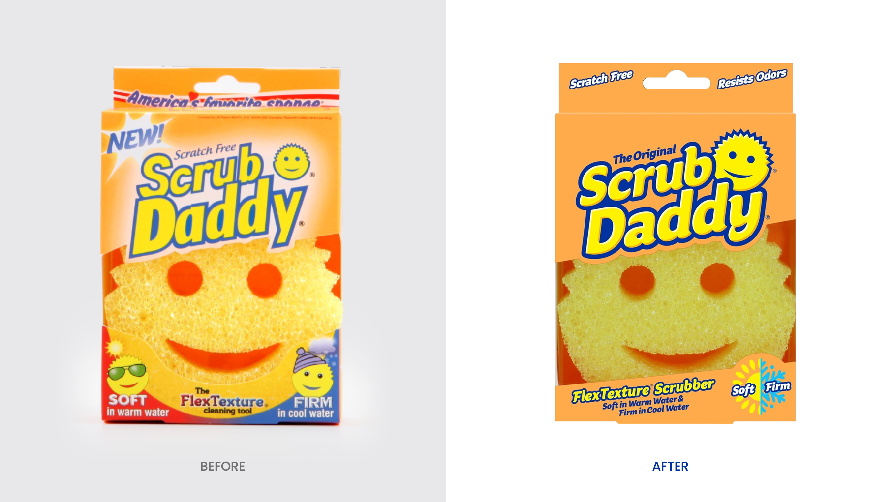
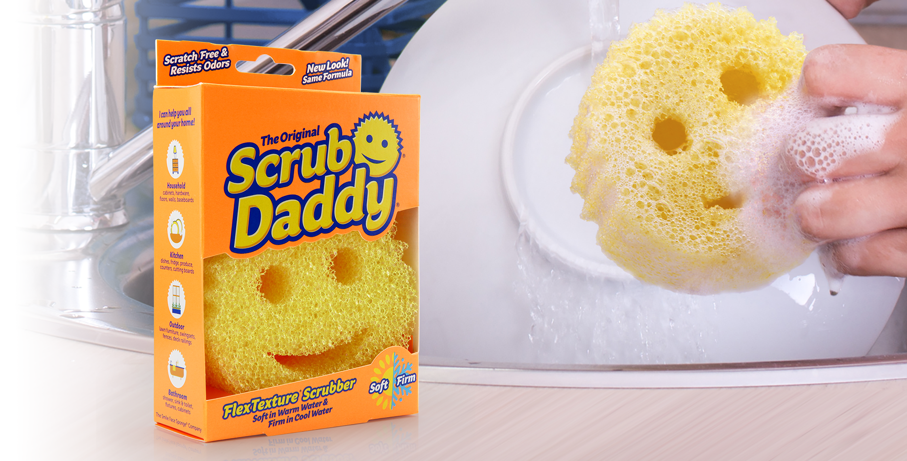
Scrub Daddy, originally launched into the public eye on Shark Tank, wanted to update their branding and packaging to better reflect the character of their hugely successful product.
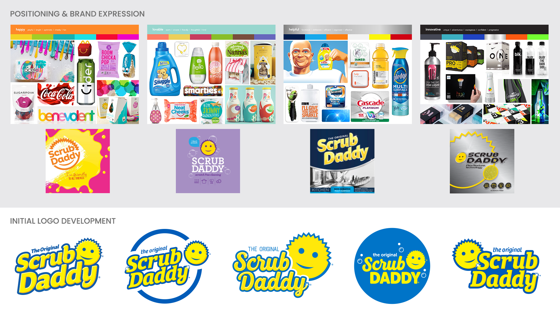
A category audit was conducted to see how brands communicate the benefits of their products and how they treat line extensions, either with color, text, and/or visuals. By teasing apart the brand characteristics, visual positioning territories were explored. Once aligned upon a positioning direction, a logo exploration was conducted. Scrub Daddy wanted to modernize their logo but without losing the essence of what had already been established in the marketplace.
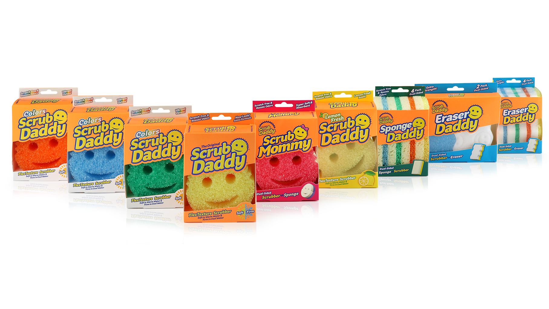
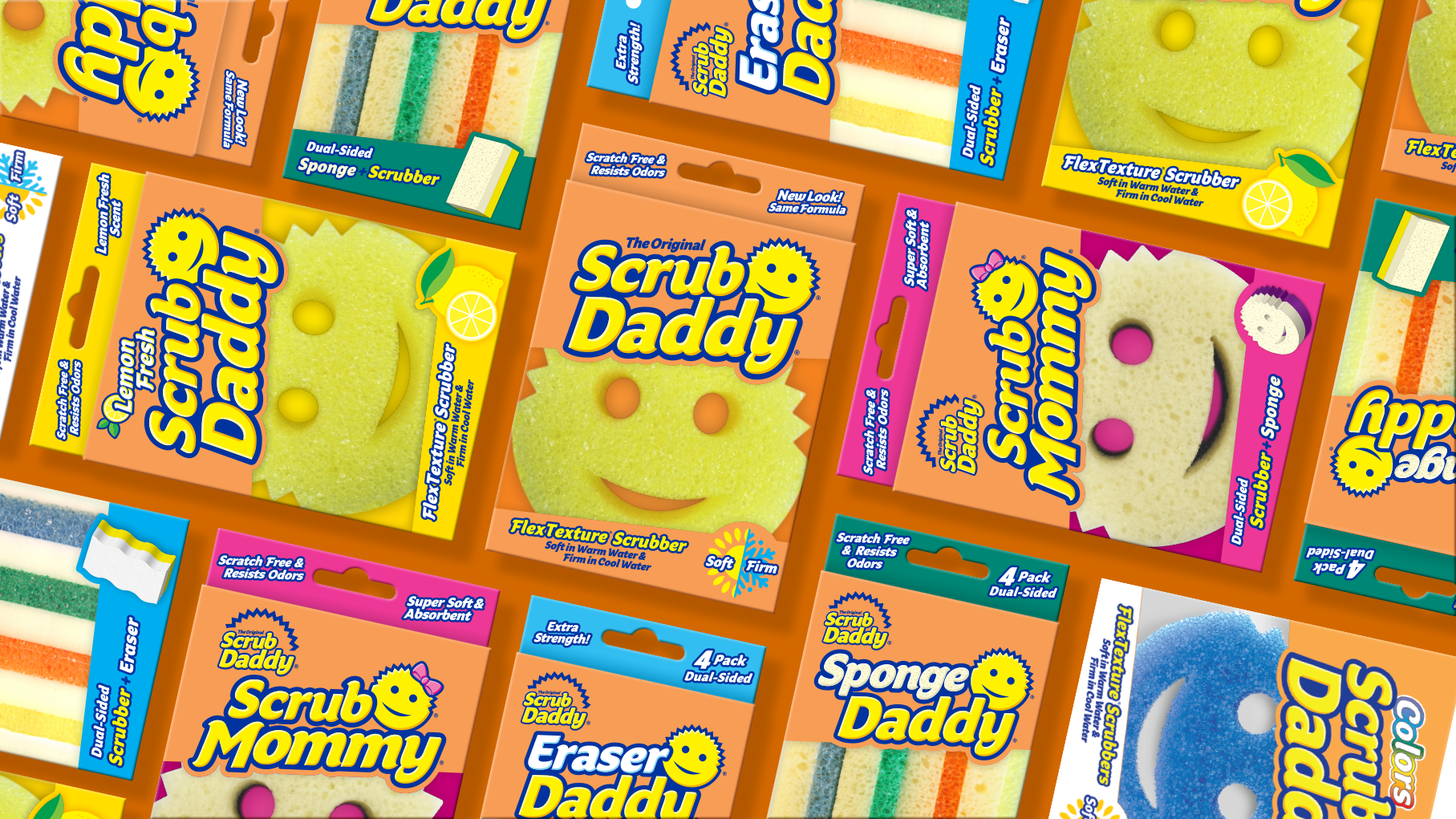
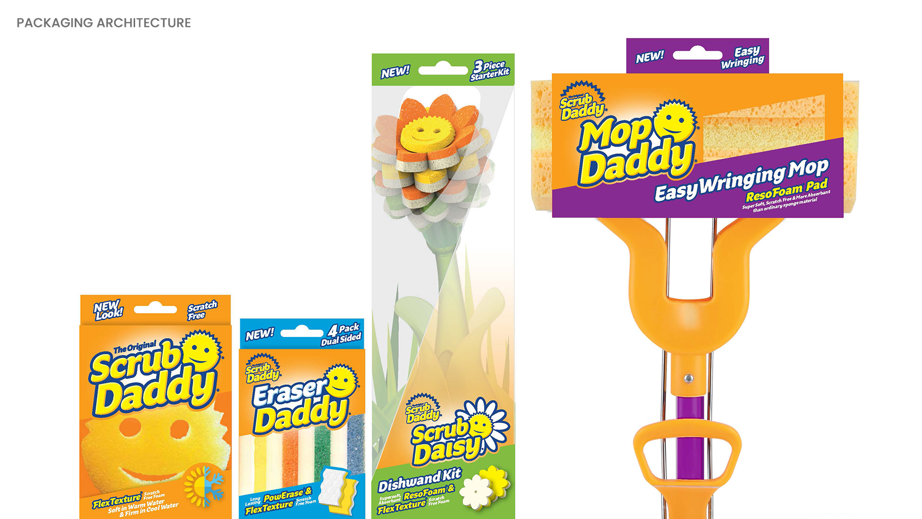
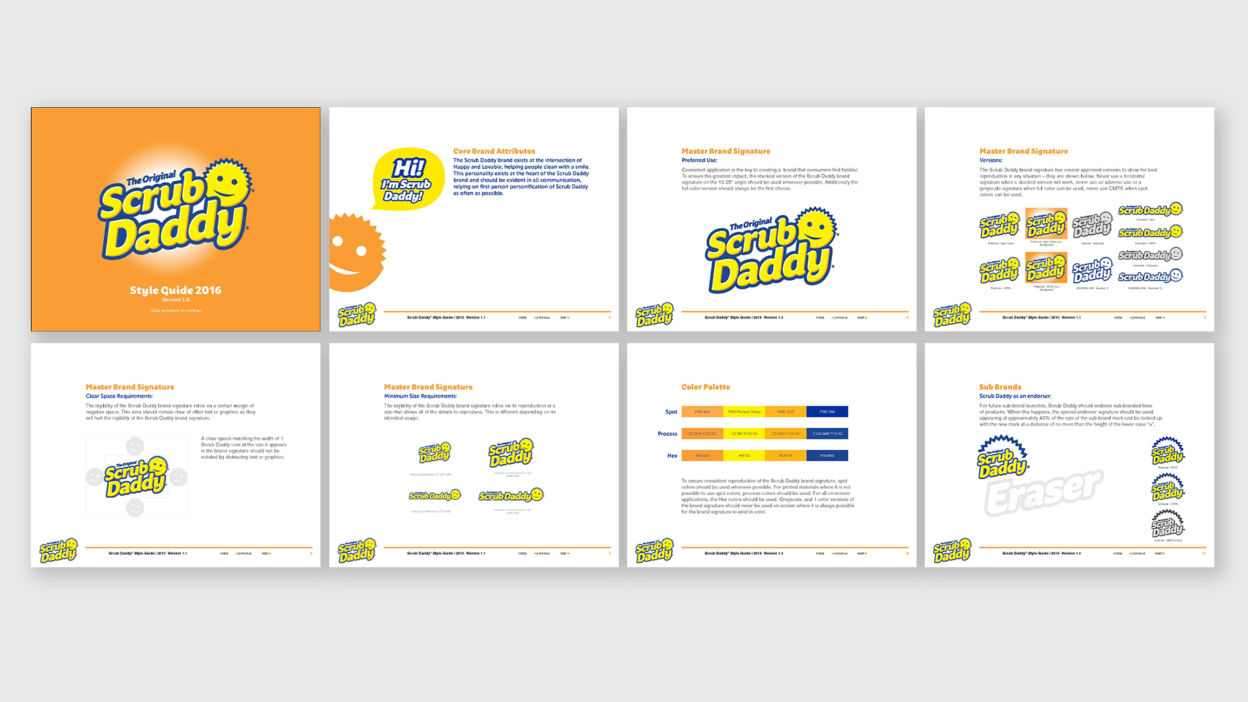
Building upon their ownable neon orange brand color, various packaging architectures were explored to highlight the features of the product inside, while also allowing for line extensions and product expansion. Brand guidelines were established to ensure the integrity of the visual identity would be upheld by various other design partners.
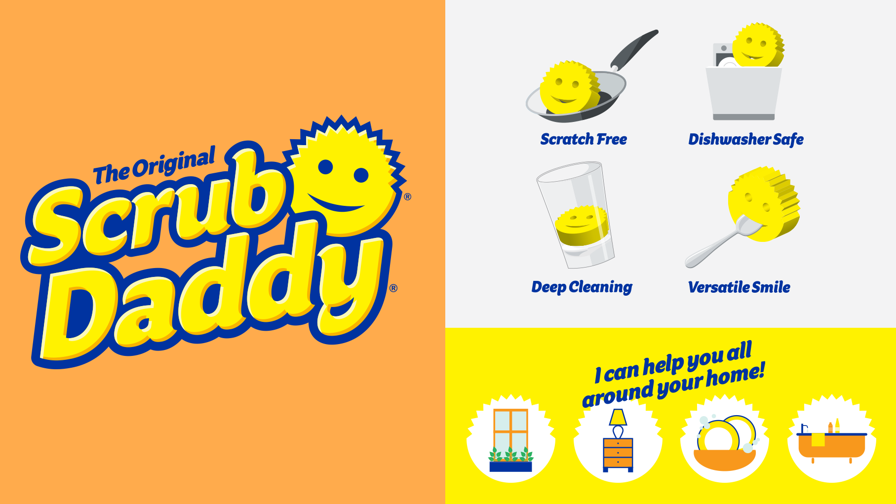
True to their start-up mentality, a winning design was chosen internally and rolled out to all SKUs. Mechanical files were created and send into print production. The brand is so beloved, and since the launch of their new identity and packaging, Scrub Daddy has successfully launched countless new products, expanding into other categories.